Background
Bingata is the Okinawan tradition of stencil resist paste dyeing. It has a long tradition, with the oldest preserved garment dating back to the 1450s. The medieval and early modern periods have a gap of preserved garments, followed by a rich archive of later extants that’s viewable at the Naha Museum.
The brilliant colors are traditionally made with pigments suspended in a soymilk base. The protein from the soymilk adheres pigments to the fabric. Lakes from plants, especially indigo, can be used as well. Many natural plant dyes that are brilliant in immersion dyeing, such as madder, are not as bright in katazome and bingata, because the dye solution has to be applied with a brush (hikizome). The brushing and saturation from the water of the dye slowly break down the resist paste, so only a limited number of layers of dye can be applied. This results in a lighter color for natural dyes applied with a mordant, so lakes are often used instead.
Unfortunately, many of the natural dyes that do perform well with brush dyeing, like safflower, are not very lightfast. In the brilliant tropical environment of Okinawa, it’s easy to see how the dyeing tradition would quickly move to pigments. Pigments easily make bright colors that stand out in the intense sunlight and don’t fade. It also explains why indigo remained popular, as both a dye and a pigment. Indigo is a very lightfast dye, it makes a brilliant blue, and it is more affordable and plentiful than mineral blues.
Soy binder produces a lightfast application of color that drapes well for the traditional Okinawan garments, it holds up well to the way pre-modern outer garments are washed and handled, and it uses local plants and minerals to obtain its color. Historically, the printing paste for bingata likely did not use soy, but instead a wild konjac root that grows locally. There is an entire institute that works to restore these very traditional ingredients here, and in their book they give a historical printing paste recipe and a step by step restoration. If you want to learn more, I encourage you to purchase their book through a service like Japan Rabbit, because it’s very good and thorough in its presentation and research.
Modernly, as far as I can tell, there are a few artists experimenting with the konjac recipes, but many have switched to soy. I can’t tell if this is because soy is objectively better, or the modern cultivated konjac is substantially different and doesn’t work the same way as the old wild stuff, or it’s simply a training or availability issue. These are experiments I have slated for a future time.
Regardless, there are some disadvantages to the soy pigment approach in a modern context. The ingredients can be expensive. Some are affordable, like iron ochre, but many of the bright, beautiful colors are not. If you’re making things for a king, like the preserved garments we have in the Naha Museum, that’s not an issue, but cost is a factor for the rest of us.
Secondly, soy adhered mineral pigment (for that matter, soy adhered anything) is sensitive to abrasion, and has a stiffer hand. This means that it isn’t the best candidate for repeated washing, or tailoring into draped garments. The Okinawans circumvented these problems by wearing undyed undergarments that insulated the dyed fabric from the sweat of the wearer, and by making garment designs that worked with stiffer cloth. However, if you want to make something like a modern t-shirt or dress, the fabric will touch your skin and need to drape fluidly. Indigo is a great candidate and exception to most of the issues, especially for white background patterns. The soy does offer some stain resistance, so that’s helpful in minimizing washing. Abrasion, drape and stain resistance properties are something I’d consider carefully and test on my fiber and dye before committing a large project. You may find it’s exactly perfect for your needs, or you may find it unsuitable for the reasons outlined above.
Choice of Synthetic Dyes
I am a craftsperson who spends their days getting dirty, and the most fashionable place I go is the coffee shop or the grocery store. I wanted to experiment with synthetic dyes and bingata for making wearable garments for my own use. I was also curious about the range of colors synthetic dyes offer, without having to construct a seasonal indigo vat. I know that this sort of project will be controversial, because the dye community is split very fractiously into The Earth Mothers That Dye with Natural Dyes and the Synthetic Heathens who Are Shamelessly Enjoying Technicolor Chemistry.
I am in both camps. I don’t share the same reservations about synthetic dyes, specifically Procion and the fiber reactives, that many other natural dyers share. I love plant dyes, their romance and their story, and their connection to nature. However, I’m not a purist that insists on natural dyes to exclusion, because I don’t think it’s a logically sound point of view – at best, I think it’s inconsistent and at worst I think it’s hypocritical. Setting aside for the moment the fact that most natural dyers also wear synthetic dyes for convenience and cost reasons, I’m not even certain we can defend natural dyes as the only ecologically sound approach. I have just moved massive amounts of dirt and organic fertilizer to my own yard to grow a small amount of indigo, perhaps enough to dye ten or twenty yards a middle shade of blue. I look at the amount of plastic and fuel that were involved in the endeavor and I can’t say it was less than the amount of carbon required to synthesize the 50 or 100 grams of synthetic procion dye in a domestic, regulated factory. The wood ash lye I’ll use on the vat is literally burned carbon, and while it was a waste product from a friend, we burned trees to make it.
If I order natural dyes, from someone with the economies of scale to make the cost go down and the environmental footprint easier, it has to be shipped to me, and I need a considerable amount of it to dye the textile, and ironically I need extra because I am dyeing with the sustainable textile, hemp, which requires a higher weight of fiber than a protein like wool. That’s a lot of fuel, even if I choose ground shipping, and the original plants are often from India or Europe. Sea shipping across the ocean, while cheaper, is also still an environmental concern because of the type of fuel used by the ships.
Conversely, procion dyes bond easily and readily with hemp, at weights of 5-10 percent maximally. As far as I can tell, they can be processed in reasonable dilution at my local water facility. They are not inherently toxic to handle, though you can develop an allergy from the powder, and as such need to wear a mask when mixing and gloves when applying. Once bonded they are safe. I can order a kilo and dye more than a bolt of fabric, often from a domestic supplier.
All of this is stated simply to illustrate that this is a complex issue deserving of a separate article, and a careful, comprehensive analysis by someone with access to data I don’t have. My assertion is that whether or not to use synthetic or natural dyes for a given project is a requirements based decision, not a virtue based one. Think it through and make it with consideration to the constraints, the environment, and the worthiness of the project. You are going to end up releasing carbon and petrochemicals to accomplish your project no matter what you do, so do things thoughtfully and with good reasons. Don’t make things that won’t be used, make small tests.
Pattern & Design
With all of this considered, I reasoned that bingata with procion dyes was a worthy effort, and I decided to try it out on a noren, because this is the smallest length of cloth that would give me meaningful feedback while still being usable if the project succeeded. It was long enough to experiment and iterate but short enough that I wouldn’t wear out my body rubbing in all those tiny detail areas.
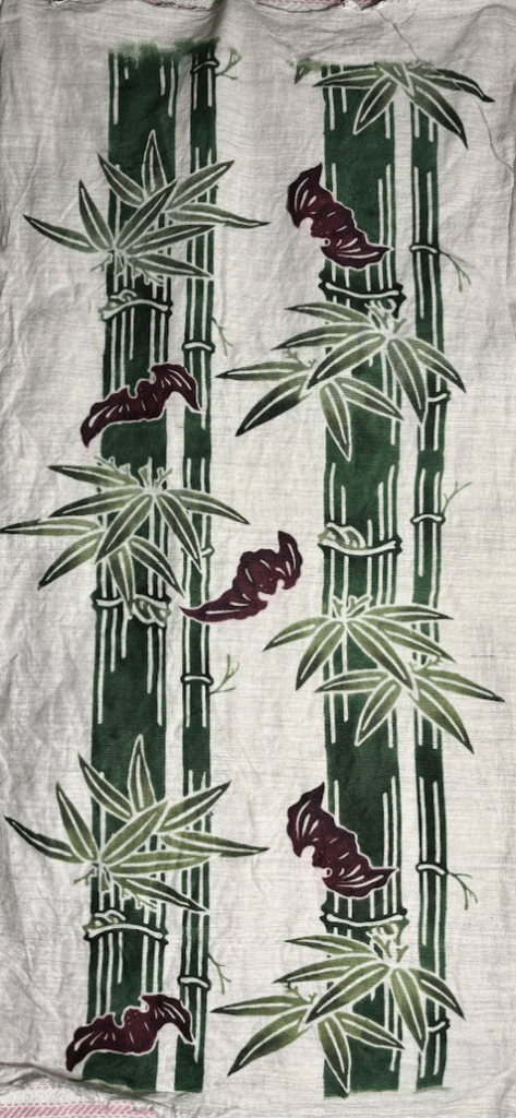
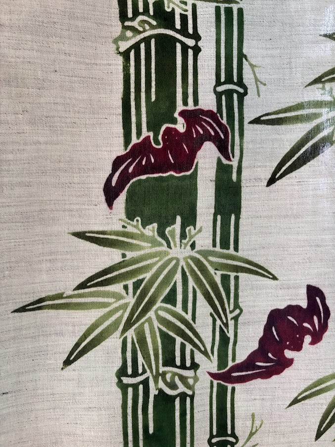
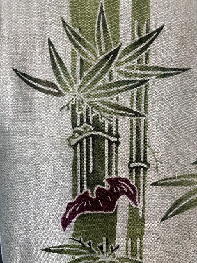
I’ve been working on a design from the Naha museum that features bamboo and bats for a while. The original is only one color, with embroidered contrasting peonies. I wasn’t going to be able to do the embroidery, so I changed the bamboo stalks green to contrast the bat’s purple, and planned to shade bingata-style.

I kept the leaves pattern at high fidelity to the original, and I modified the aesthetic of the bats to make them a bit more repositionable. I changed some of the positioning and layout to get a seamless layout without some of the arrangement constraints of the original.

I tested a few potential color combinations, and landed on this one. I had some khaki predyed noren fabric I got at discount, and I thought this would work well with it.

The first time I cut the stencils, everything went alright except for the gauzing. I didn’t remove the stabilizing backing paper before the gauze dried, because it took a long time to seperate all the islands. Now I know the order is different, and that I should remove the backing as soon as I get tackiness between the gauze and the stencil and cut all the struts right away. I used acetone to remove as much of the excess paint as possible, and it wasn’t perfect, but it’s a good tool to have for future mistakes.
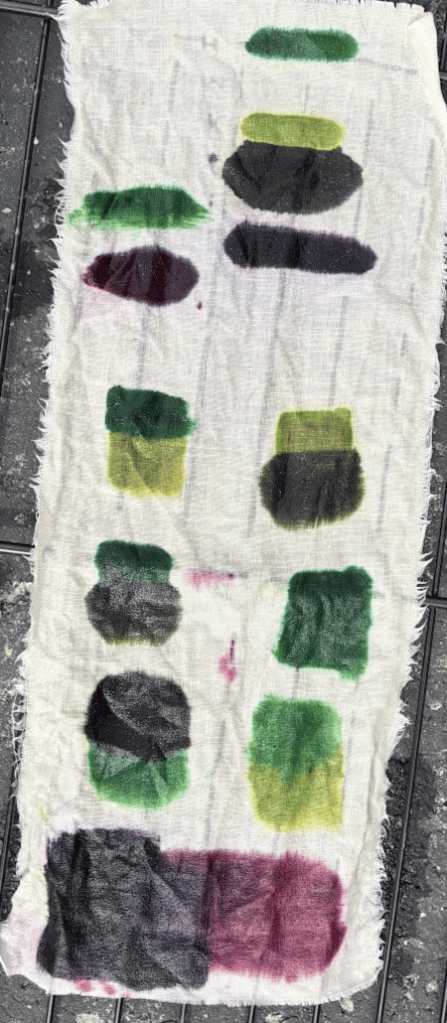
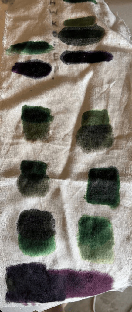
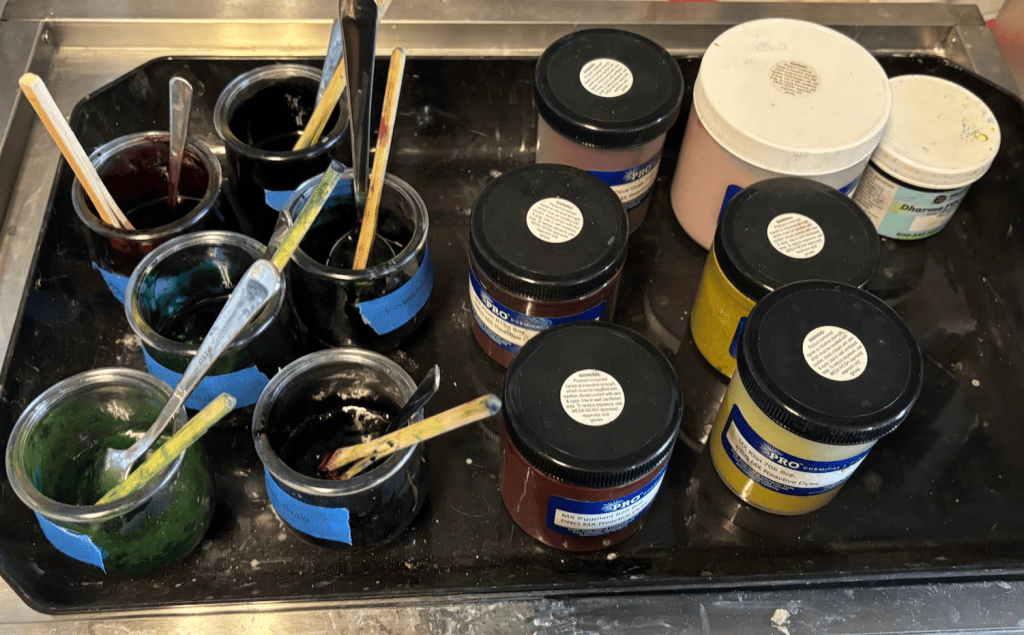
I tested out possible colors, and the dye itself, on a swatch. Some of the dyes were several years old, but they still had vibrant color. Synthetic dyes can mismatch easily because of their saturation, and mixing them together can often yield a more convincing aesthetic. Natural dyes are made of many different chemical compounds and dyes, but there are about 13 procion dye primary colors available. Blending a few of these makes for complex, interesting colors that mimic the tonal richness of natural dyes.
I used some premade procion blends and then mixed some of those to get what I didn’t have on a swatch of similarly colored linen. Then I steamed it, and washed it out. I noticed right away the purple bled, and needed lots of cool water to keep it from backstaining. This was a problem that persisted to the final product that I never fully solved, but was able to improve somewhat simply by washing many times and drying flat. Testing all your dyes before committing to a last piece is crucial, and testing on a swatch will help you narrow down color choices as well.
Sizing
Every modern text and website on stencil dyeing (even some japanese ones) will tell you to use sodium alginate for dyeing with procion dyes. Soy can cause streaking and other issues because the protein reacts with the dye. Procion dyes were originally developed to work with protein fibers, but they worked poorly, so this problem makes sense.
I have been using sodium alginate for a few years now, to my dissatisfaction. It performs acceptably, not really well, and very poorly if you size the fabric with it pre-paste. I started sizing twice, once at the start and once after paste up, to accommodate repeat and geometric patterns. Sodium alginate forms lakes with the procion dye and flakes off chunks of dye in the wash process that are very difficult to wash out. This tracks with its chemistry, but I’m not sure how to solve it. I was trying adding less or more or not sizing or adding too much dye to just outsaturate the problem until I came across funori.
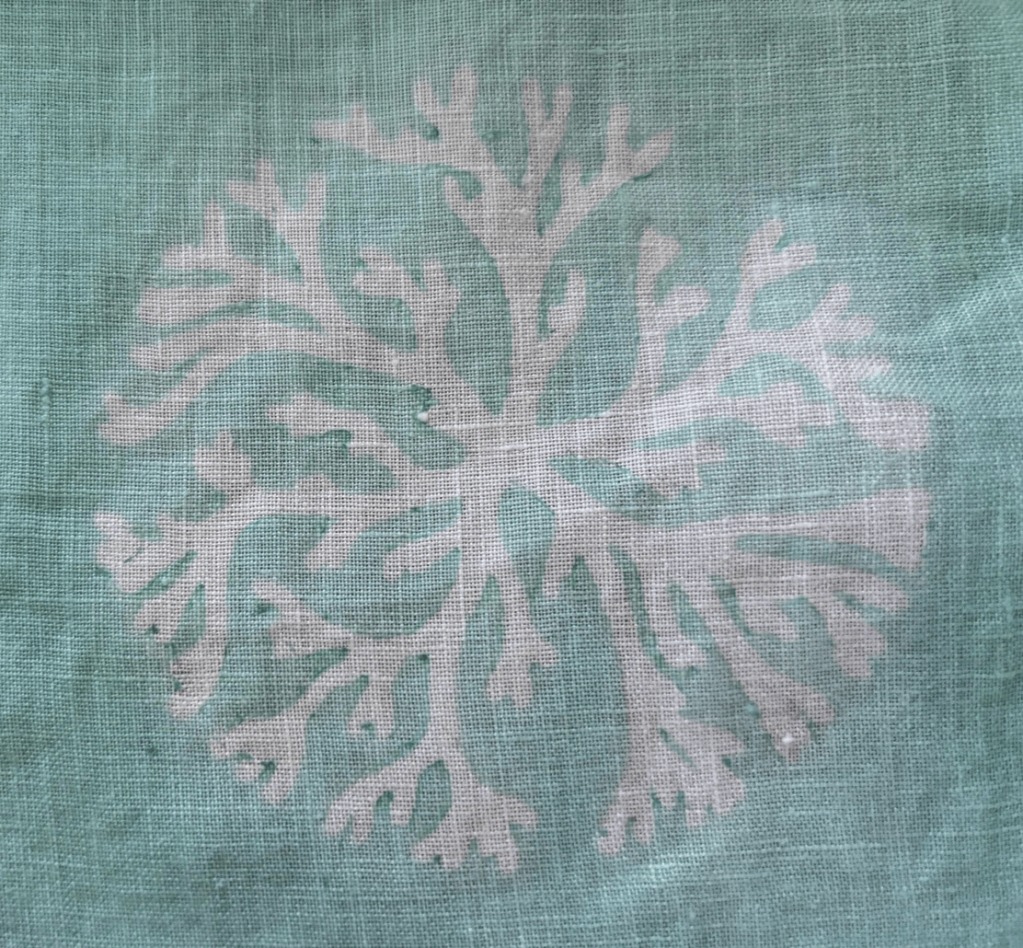
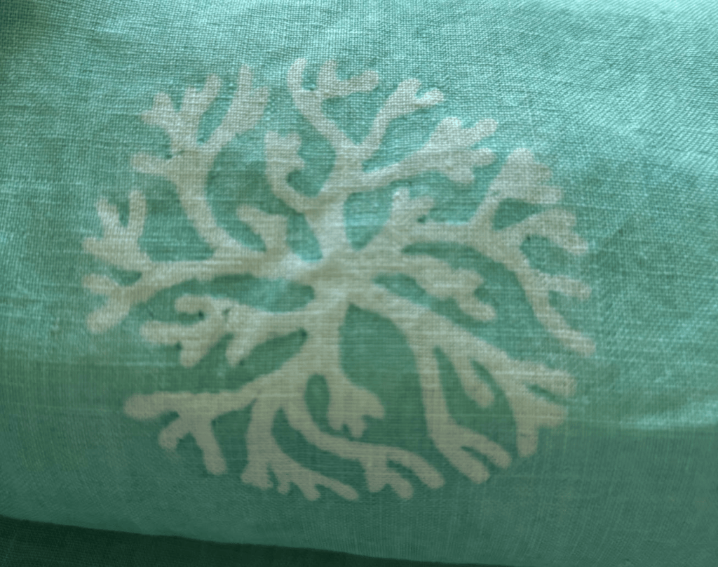
When I stepped into natural dyeing, I saw mentions of funori. In my limited trials, it seemed to give the fabric a better hand than alginate did. Funori’s chemical structure forms longer, more flexible chains than alginate, and it seems to penetrate the fiber better as well rather than sit on top of it. When I tried it for indigo, it didn’t flake the way alginate did, and it was easier to wash out. When it didn’t wash out, it wasn’t unpleasant.
Despite both being seaweed derivatives, the chemical structure of funori is significantly different from the chemical structure of sodium alginate, and that is the reason for the difference in performance. There are at least two good papers on the chemistry of funori – one from JAIC in 2005 and Funorans from Gloiopeltis Species; the chemistry of sodium alginate is on wikipedia. In very brief summary, the two compounds form different 3 dimensional structures and have different arrangements of negative charges along their chains. These differences are why they have different viscosity, gelling, and penetration behaviours, and they also react differently to salts. All three links have chemical diagrams you can look at to understand the behaviour better, but explaining them is an article in its own right.
On the practical front, I found that Kuriyama Bingata, a professional katazome studio in Kyoto, is using synthetic dyes, and they still use funori (in fact, they have a whole video on it). It’s often mixed with soy, but it’s also used on its own. I decided to try it as an alternative to sodium alginate, as both the presizing that helps the fabric lay straight on the pasteboard, and the hand is drapier and softer.
Presizing has almost no documentation, and from what I can tell looking at scattered documentation, the scouring and sizing is often done by the weaver, not the dyer. I see references to “starching” but I don’t see any indication of what that might be, except maybe rice starch. Regardless, I know that funori doesn’t interfere with the process, and has a nice hand, and using it for both stages is expensive, but efficient. In the future, I want to experiment with rice and konjac starch, but my immediate goal was to get anything to work.
Here’s a video of a yuzen studio applying jire (the name for the sizing liquid, which could be soy or funori). 京友禅染めの着物ができるプロセス!上皇后美智子様も利用された着物の裏側に密着!.
The trouble with funori is that it’s a natural material and almost nobody discloses their formula for the % they use in water. I found this extremely irritating, until I realized that there’s a good reason for it beyond secrecy: the exact amount is specific to the fabric. I needed a rough guideline, though, so I worked backward from Kuriyama Bingata’s video on funori and a few instagram videos, and a Yuzen formula pdf I found on the internet. I don’t know the provenance of the Yuzen document, but the formulas look plausible. If the name in the filename is the one I think it its, it’s the amazing Tourokuya – (Website , Youtube , Instagram ). He’s the hikizome instructor for Aikuma dye works, and a brilliant artist; he definitely knows more than I do, in fact, you should probably skip the rest of this article and go watch his content :).
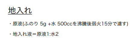
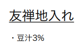
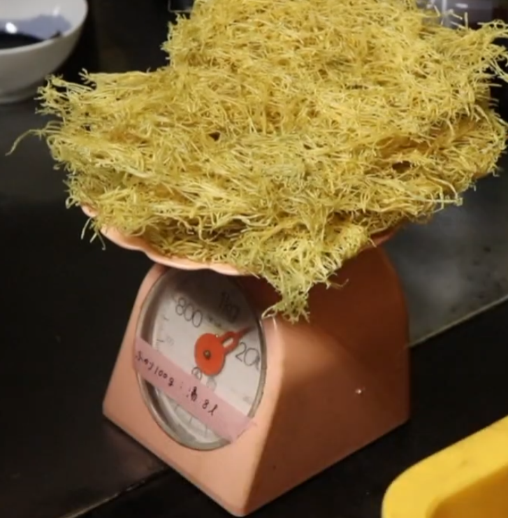
Right, so if you’re still here, It seems it’s typical to brew funori at a higher concentration – around 1 to .5% – and then dilute it as needed for different parts of the process. This allows you to store a smaller jar in the fridge.
Kuriyama Bingata’s working solution is closer (approximately) to .3175% for the post paste sizing. I’m not sure what they’re using for their dye, but it looks thinner and it might not have funori in it at all. And likewise, their presizing may come from their manufacturer or not at all (because they’re only pasting on one side).
Over the fall, I did some trials with the amount of funori that would work well for the thinner linens and hemps I use. I’m essentially going to have to binary search the correct number for each fabric, and it seems that this is what professional katazome studios do as well.

I trialed applying the funori as the initial sizing with both a brush and dipping and wringing. The brushing, I used a more dilute solution and then applied it on the front and the back. For the wringing, I dipped in a stronger solution and then wrung the fabric out and suspended it, then ironed when dry.
While both approaches gave acceptable results, the brushing took much longer and was not quite as uniform. In addition, one thing I didn’t know is that you need to remove the shinshi halfway through the drying process, or the fabric is distorted. Ironing it back into a flat shape is quite a process.

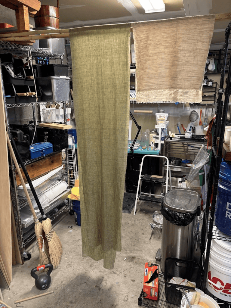
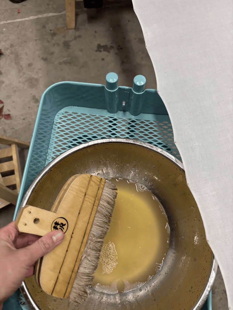
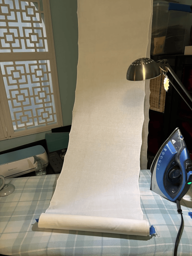
One of the most surprising things I encountered was how much a small variation in the amount of funori (.3% vs .5%) could change the stiffness of the fabric or the likelihood for the dye solution to seep. It’s fairly easy to adjust an error in under-sizing; even at the final stage, you can just use a more concentration solution when applying the dye, but it’s harder to apply the dye if there’s too much size. Tweaking and refining the numbers seems like it’s going to be its own project.
The final numbers I settled on for this project after tests: .5%, in the wringer, for the initial sizing, then, .3175% for the second size, and then finally .5% for the dye.
The one issue that the dye solution had with the funori is that… funori seems to react to baking soda that’s used in the solution to bring the dye up to the appropriate ph when steaming. It gels to the point where you’re almost brushing with dilute jello. From what I can tell, this happens because of an ionic bond that its sulfate groups will form with salts – and baking soda is a salt. The only way to bond procion dye without mixing in soda ash or baking soda (both salts) is to paint the cloth with sodium silicate at the end. Sodium silicate requires careful handling – I’m considering if I trust myself enough to try.
Paste
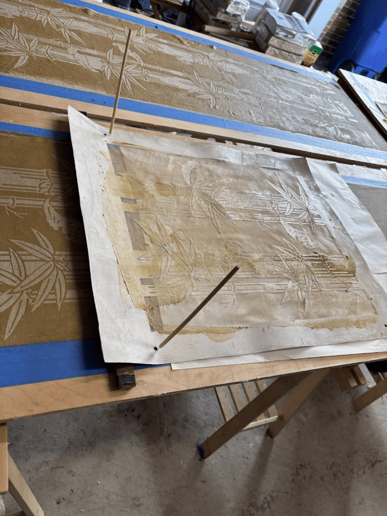
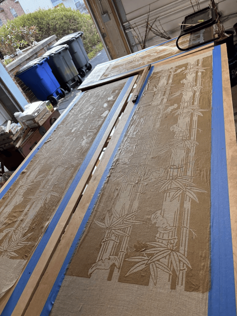
I used my standard paste formula, 4:6 nuka to mochiko, with salt and pickling lime added. It went down fairly easily. My registration is improving with practice and better setup. I used painter’s tape to make “rails” to position the wavering linen fabric against, and to keep extra paste from getting on the board. I use a long, thin piece of tropical hardwood to lean my stencil on as I paste repeats, and I have found this is the easiest way for me to work.
I do need to recut the stencil after the paint clogging mishap. I had a lot of touch up to do after pasting, where the paste didn’t quite go through the clogged mesh.

Dye
I used the following dye solution:
- 100 ml of funori .5% solution, gently heated
- 10g of urea (dissolve fully)
- 2 grams of baking soda
- 7-10g of dye (dependant on color)
This seemed to work well. It probably could go down in dye percentage, meaning I’d have to wash it fewer times, but the excess color eventually all washed off and the garment was still vibrant, even with the kiwi, which is typically more pastel than the swatch turned out.
Often, for bingata, I deliberately don’t sieve blends of dye with reds, because for things like leaves the speckling turns into streaked lines I can manipulate into interesting variations. For hikizome, I do sieve, because otherwise streaks show at the beginning of the bolt disproportionately.
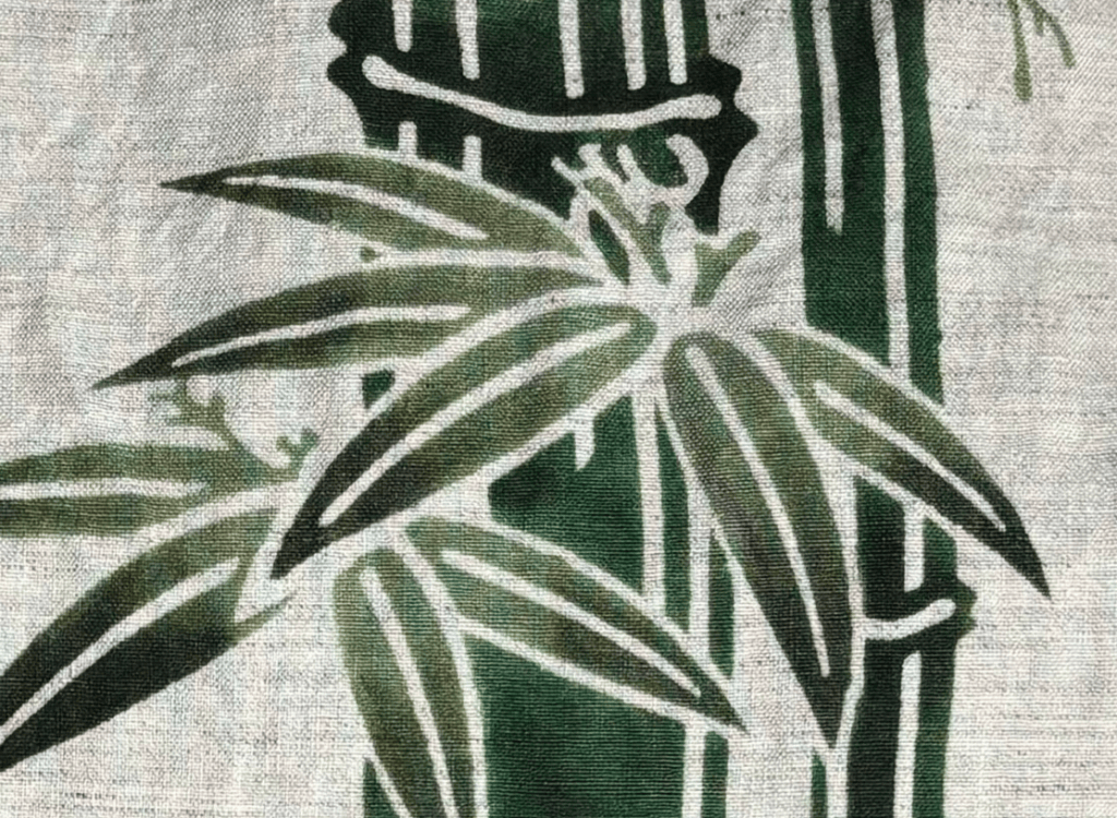
I tried applying the dye shading several different ways over several different projects, because I was curious about how the order of dye application affected the outcome.
The very first time I tried procion bingata, a few years ago, I actually mixed seven different dye colors at once, with soda ash instead of baking soda, and directly applied them to the fabric. I blended all seven colors in real time. It was harrowing because the dye solutions expire in 30-60 minutes with the soda ash directly added, and then the fiber reactivity begins to degrade. I had to remix many times, and a lot of dye was wasted.
The effect, though, was amazing!

Obviously, I needed a more efficient way to dye, and I also wanted one where I could stop and take breaks. Baking soda is not alkaline enough on its own in cold water to make the fiber reactive dyes bond, but baking soda reacts when heated to form sodium carbonate. Therefore, I could steam the cloth after painting all the dye, and start the reaction of the dye bonding to the fabric at the end, rather than having the reaction occur the moment the brush met the fabric. With this method, I could conserve dye and take breaks rather than trying to paint as fast as possible. All that rubbing and scrubbing with the little surizome brush wore out my hands and shoulder; I can’t figure out how people color a whole kimono (perhaps it’s a matter of team effort).
I tested this out on a swatch first, and it worked brilliantly.. For my final project, which was a noren and a wall hanging, I put the dark shading down second on the hanging, and the dark shading down first on the noren. I had some theories about which was going to be more effective from when I was applying the color and bonding it all at once. With soda ash, whatever comes in contact with the fiber first is the dominant color. You can put color on top of the first color, but the result will always be a blend and not an opaque covering. I learned this the hard way when I did a banner that was supposed to be green and black and I brushed the green on first; putting black overtop just made a sort of dark muddy green instead of black. The opposite of how pigments work.
Here you can see, from the front and the back, how it worked out for the shading first:

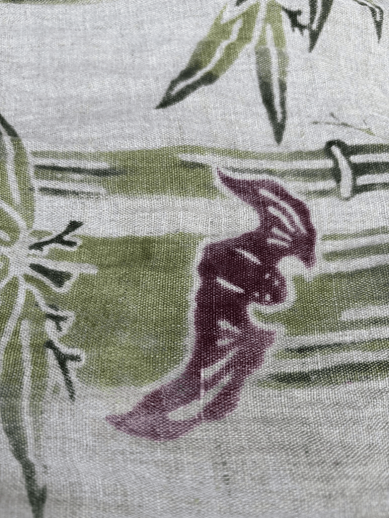
And then the shading second. This is not a one to one color comparison, as I did this smaller swatch first and changed the coloring to make it more harmonious. The blending itself, and how smooth it is, and how the colors look front and back, is what to pay attention to.

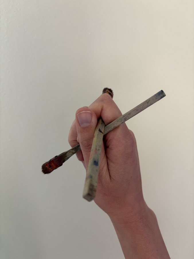
The ergonomics of the brushes, when held in the cross-shape with two in the hand that’s typical of bingata painters (one brush to apply, one to blur) is intriguing. Individually, the brushes are thin handled and tiring to hold (I was actually putting crochet cushions on them), but in the cross position it’s somehow… more comfortable and forces you to paint from the shoulder, not the wrist. So I recommend it, even if it takes a bit of getting used to.

Different things happen if the fabric is slightly damp, or wet. These are things for future experiments that I encountered accidentally. Wet fabric blurs the dye; it makes it easier for the brush to glide and it also dilutes the color a bit. I have purchased a fabric mister that applies moisture uniformly, and I’m eager to try more hikizome techniques with it.
It’s evident that shading first makes the fabric more attractive on the flip side, because the shading is more apparent. Conversely, shading second makes the fabric more contrasted on the front. They’re equal, of course, if you do them simultaneously, with soda ash. The differential effect of subsequent layers is more pronounced with soda ash, than with steam, which also seems to blur the colors slightly as well. Soda ash will leave the dye right where you put it, when it dries.
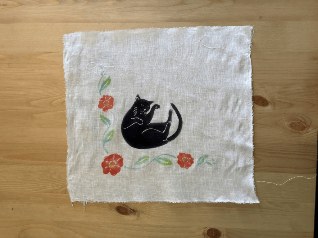
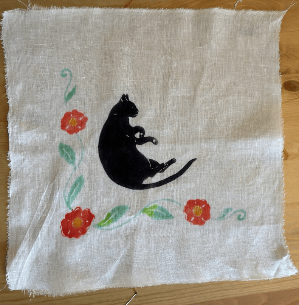
I present these techniques as options. Looking at two very similar pieces side by side, my preference is for shading after laying down the base color. I honestly can’t tell much of a difference, but it’s easier to put the shading down after the base color because the fabric is already somewhat saturated with dye, and seems to accept the shading more readily.
The one I haven’t worked out fully yet – I understand how to do it theoretically, but not yet in practice – is dyeing on both sides well. I’ve done that with ombre hikizome, as a small test, but not with bingata on a small, detailed scale. Double sided would be ideal for noren, because they are meant to be viewed on both sides. Bleed is the real problem here; the double registration issue is solvable, just difficult with long, detailed, unstable stencil.
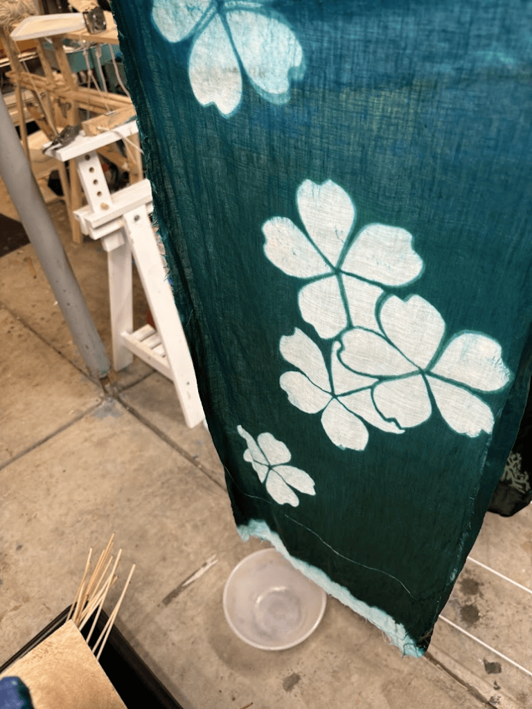
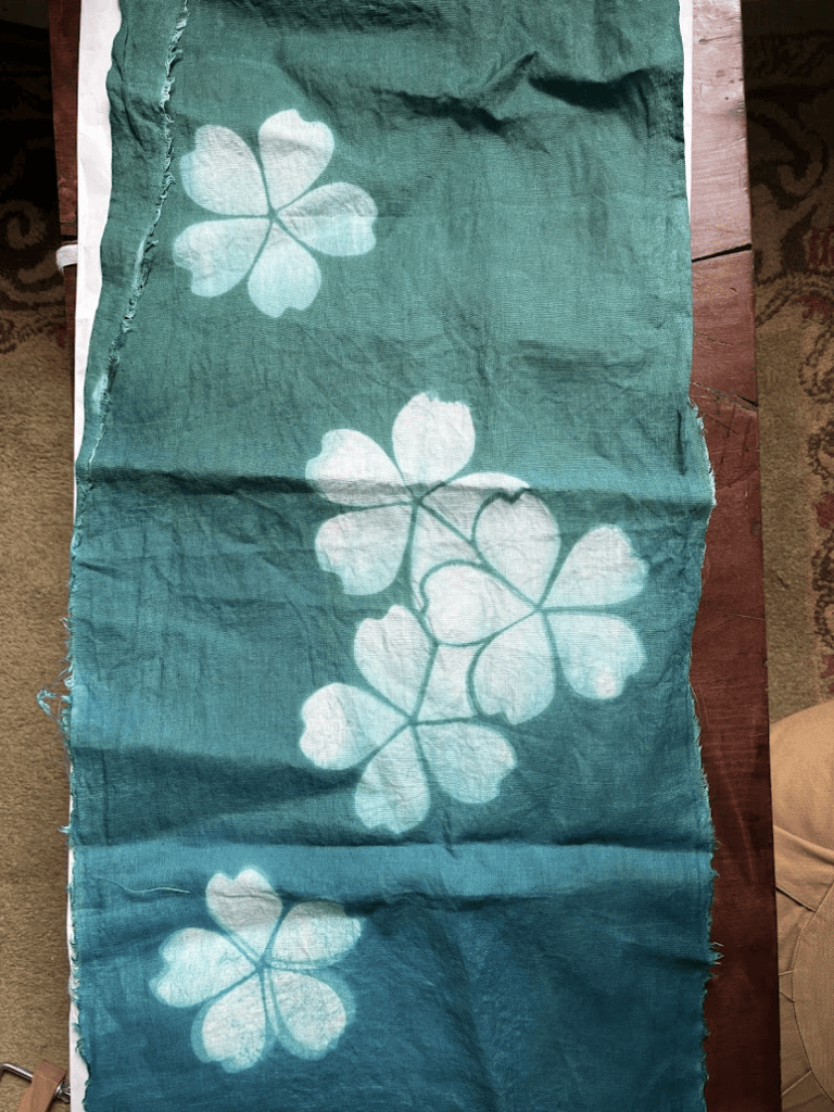
Interesting, kuriyama bingata does NOT double sided dye. They’ve just calibrated their sizing so carefully that the reverse looks palatable, and that’s good enough for a yukata. It probably keeps the cost down as well. I’m sure they’d be perfectly capable if asked – they simply don’t for their tanmono offerings. I don’t know if I’m satisfied with that approach for making noren. Actually, I know I’m not, and that’s probably going to be one of my next experiments. I want to make a procion bingata noren that looks equally good front and back, and I don’t think I can get there by calibrating the sizing perfectly. I think I’d have to paste on both sides and dye on both sides, but carefully, relying on each side to saturate the color of the other, somewhat.
Steaming
Initially, in my first experiments, I did not steam the fabric, but instead used soda ash mixed with dye directly. It was cold in the garage in fall – I thought I got the temperature in the dye studio up to 70 degrees, but I clearly didn’t for long enough. Even though the dyes were new, the results ended up dull. You can also see, if you look closely, I was still calibrating the sizing issues with sodium alginate.
I really didn’t anticipate this, because my first success was in the summer, with the bingata style birds, which turned out fine.
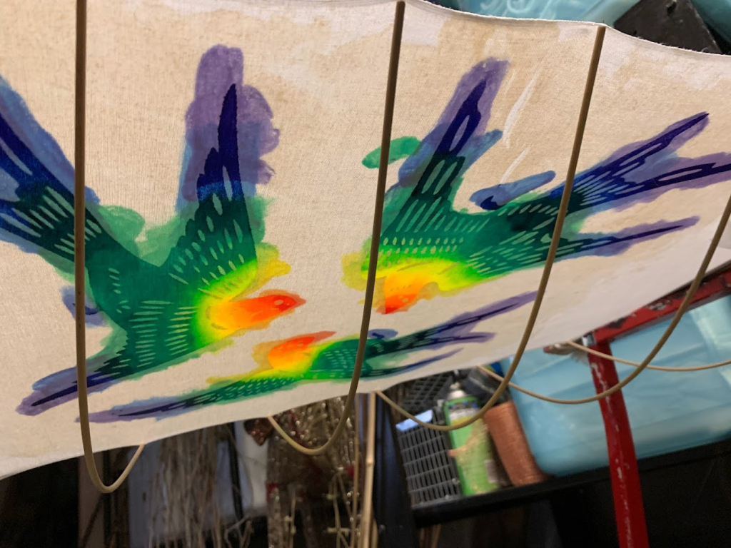
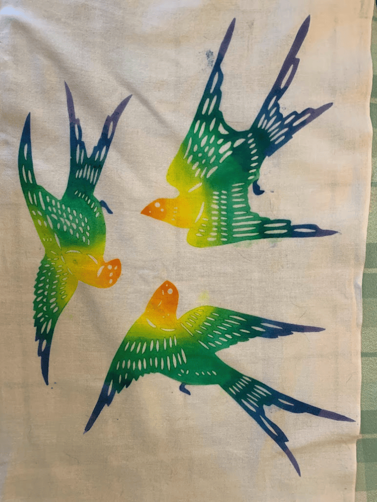
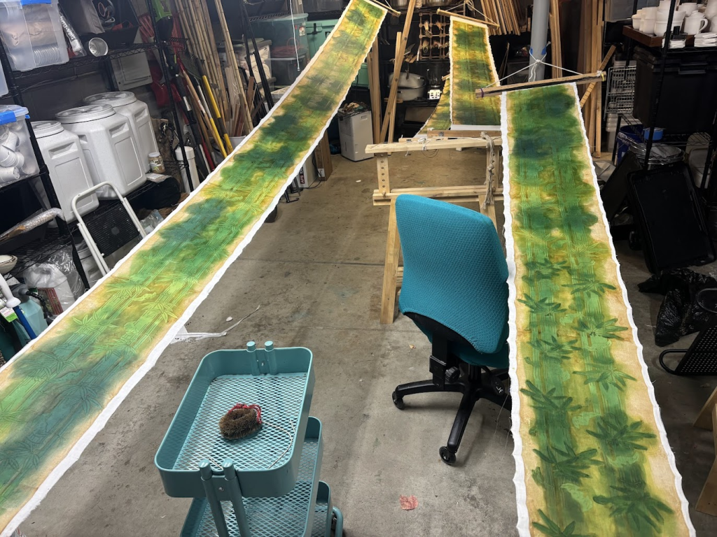

The obvious solution was to bring the heat back later in the process, rather than trying to heat the whole garage to 80 degrees. I steamed everything in a tube of newsprint for 15 minutes, immediately unwrapped it, and let it cool and dry completely before washing it out.

Cleaning & Finishing
I did not try to remove every last bit of stiffness from the cloth like I do with yukata. I rinsed in cold water with synthrapol, to immediately remove the excess dye, and then I let the paste come off, the water always moving, because that purple bleeds and bleeds and bleeds. I needed a lot more rinsing, more consistently, with the purple (the green was fine), and several washes of synthraprol, hot and cold, always alternating. As to why this is, I don’t know. I don’t generally have issues with crocking, and I didn’t accidentally use acid dye like I did that one time. It’s consistent, it happened across multiple pieces, and it happened with two other previous purple projects. Amethyst and Plum and related purples bleed more. Reds don’t bleed as much for me usually (sometimes). There’s a chemistry deep dive here I need to do; which specific Procions are the problem, and why.
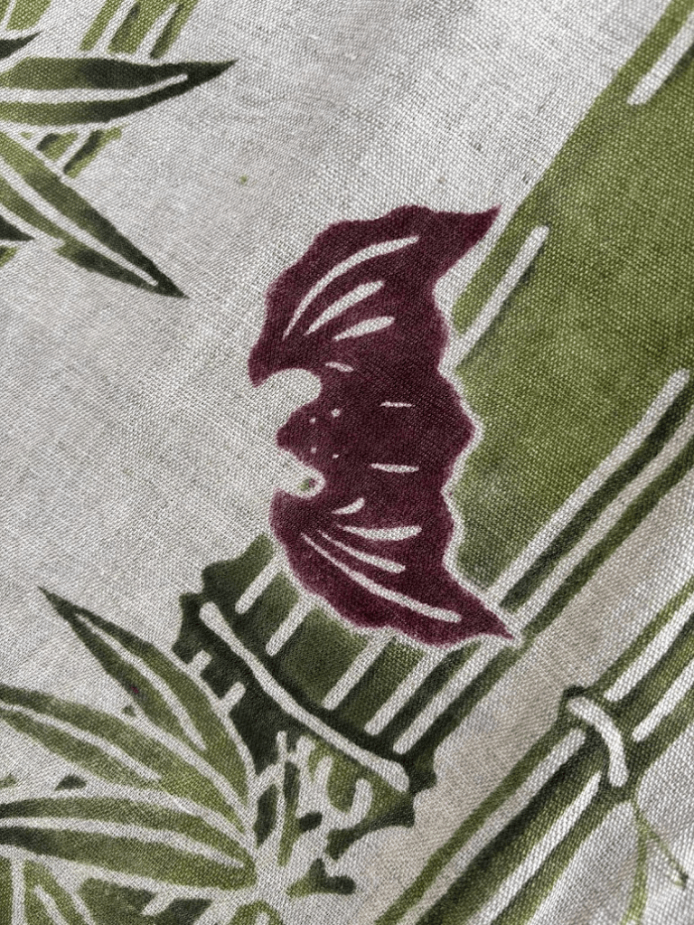

For now, I just washed it four times and lived with the minor bleed as charming, but on the long arc I’m going to solve it.
In the end, it washed out beautifully.

I have a wall hanging and a noren. I’ll keep one, and give away the other. As to the final, original large scale robe, I’ll make it when I have redone the stencil.
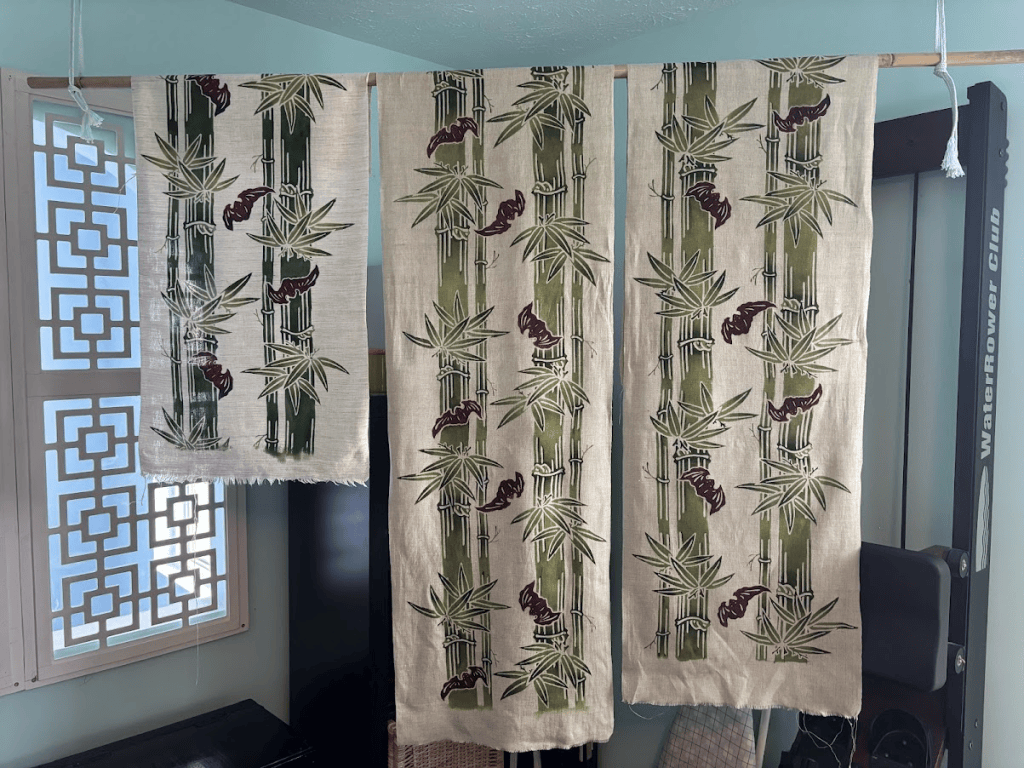
Future projects include double sided procion dye, more fun with hikizome, getting the bleed tacked down, and then finally, finally, NATURAL DYES WITH KATAZOME, because I have worked through the sizing satisfactorily.
Bibliography
1. Swider, Joseph R., and Martha Smith. “Funori: Overview of a 300-Year-Old Consolidant.” Journal of the American Institute for Conservation 44, no. 2 (2005): 117–126. https://cool.culturalheritage.org/jaic/articles/jaic44-02-005.html
2. Wikipedia. “Alginic Acid.” Last modified February 19, 2026. Accessed June 10, 2026. https://en.wikipedia.org/wiki/Alginic_acid.
3. Tuvikene, Rando, Marju Robal, Daisuke Fujita, Kadri Saluri, Kalle Truus, Yuri Tashiro, Hiroo Ogawa, and Shingo Matsukawa. “Funorans from Gloiopeltis Species. Part I. Extraction and Structural Characteristics.” Food Hydrocolloids 43 (2015): 481–492. https://doi.org/10.1016/j.foodhyd.2014.07.010
4. Nakano, Eiko., Stephan, Barbara B.. Japanese Stencil Dyeing: Paste-resist Techniques. Japan: Weatherhill, 1982.
5. Saida, Jiro (橙緑屋). “天然染料顔料染めの工程” [Process of Natural Dye and Pigment Dyeing]. August 31, 2020. PDF. https://earthnetwork.or.jp/wp-content/uploads/2020/09/2020jiro.saida_Yuzen_text.pdf.